
A 1-month UX design sprint creating a mobile app that helps people learn how to cook healthier meals. Working as a team of five, I was involved across every phase from user research and persona development through usability testing and final prototype. The challenge was finding the right balance between community and education, and designing something that felt genuinely useful rather than just another recipe app.
Understanding the User
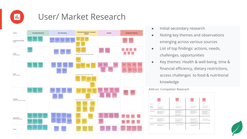
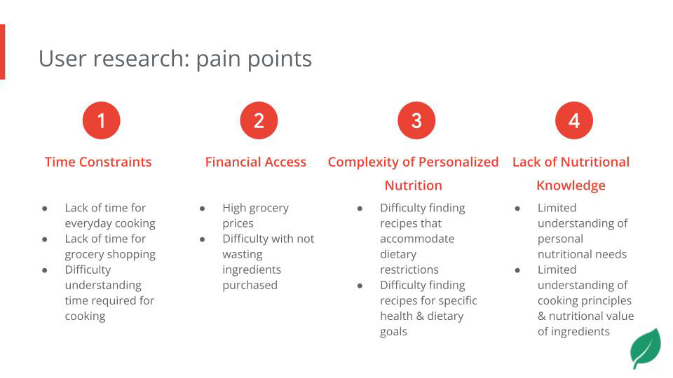
Our initial research surfaced four consistent pain points: time constraints around cooking and grocery shopping, the complexity of personalized nutrition, limited nutritional knowledge, and financial barriers to eating well. These shaped every design decision that followed.
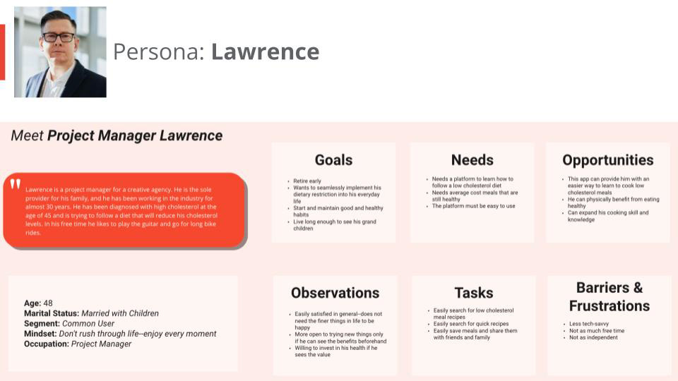
We developed two personas to represent our target users — capturing different relationships with cooking, time, and health goals. These kept our design grounded in real needs rather than assumptions.
User Personas

Solution Ideation
With our users' pain points defined, we asked: how might we help users with time constraints learn to cook healthier meals? And how might we help users with limited nutritional knowledge build better cooking habits? These HMW questions guided our ideation and led us toward a social recipe-sharing model — one where community engagement and education reinforce each other.
Design Process
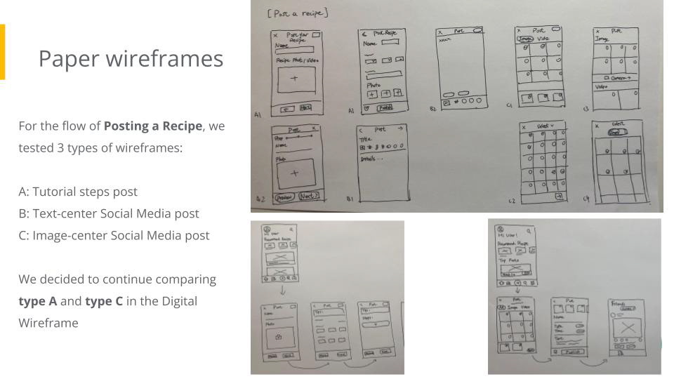
We tested three wireframe directions for the core posting flow before narrowing to two for digital prototyping.
From there we built a low-fidelity prototype covering four key flows: posting a recipe, rating a friend's post, commenting, and managing notifications.
Usability Testing & Affinity Mapping

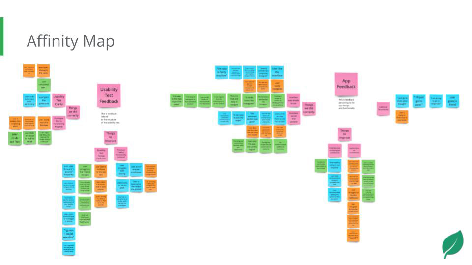
We recruited three participants from an initial pool of 18 survey respondents, selecting those who best matched our personas. Testing revealed three key areas: users found the app intuitive overall but struggled to locate notifications, the leaf rating icon wasn't self-explanatory, and filters for cuisine and cook time were highly requested.
We synthesized our findings through affinity mapping, grouping observations into themes around ease of use, navigation, and feature requests. This made it clear that the notification system and search functionality were our two highest-priority areas for iteration.
Final Design
The final prototype refined the information architecture, replaced the leaf icon with a clearer rating system, surfaced notifications on the home screen, and introduced more robust search and filter options.
Accessibility Considerations
Accessibility was a core consideration throughout. Normal text passes WCAG AAA at a contrast ratio of 19.77:1. All touch targets meet a minimum size of 24x24px with 10px spacing, and key interaction buttons are placed in easy-to-reach locations, ensuring the app is usable for a wide range of users.
Reflection
While this marked the end of our project, for future iterations I'd push for:
- Extensive user testing after the completion of the hi-fi prototype with a diverse sample of users to ensure that the app truly meets their needs.
- Refining the search and filter experience, which users flagged as the highest-value area for improvement.