Developed and presented a distinct brand identity for an entertainment and media law firm, refining one into a cohesive final design. The final concept balanced authority, creativity, and modern appeal to resonate with high-profile creatives.
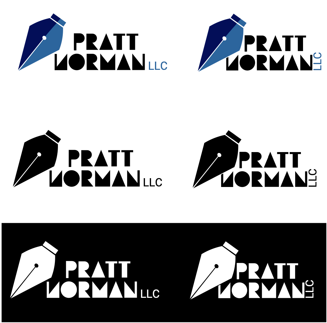
The brand logo is a word mark with a graphic symbol - the quill. Pratt Norman invests in great ideas which is symbolized by this icon. This element also symbolizes the brand’ s smart and hard working personality in addition to being a point of connection between the firm, its audience, and industry.
As a colour of trust and authority that puts people at ease, blue makes up the brand foundation with 2 variations of the colour included to balance the pink, which adds a touch of contrast to reflect the brand style and modernity. Black and white are added as neutral bases to use as needed for legibility and bases for branding elements.
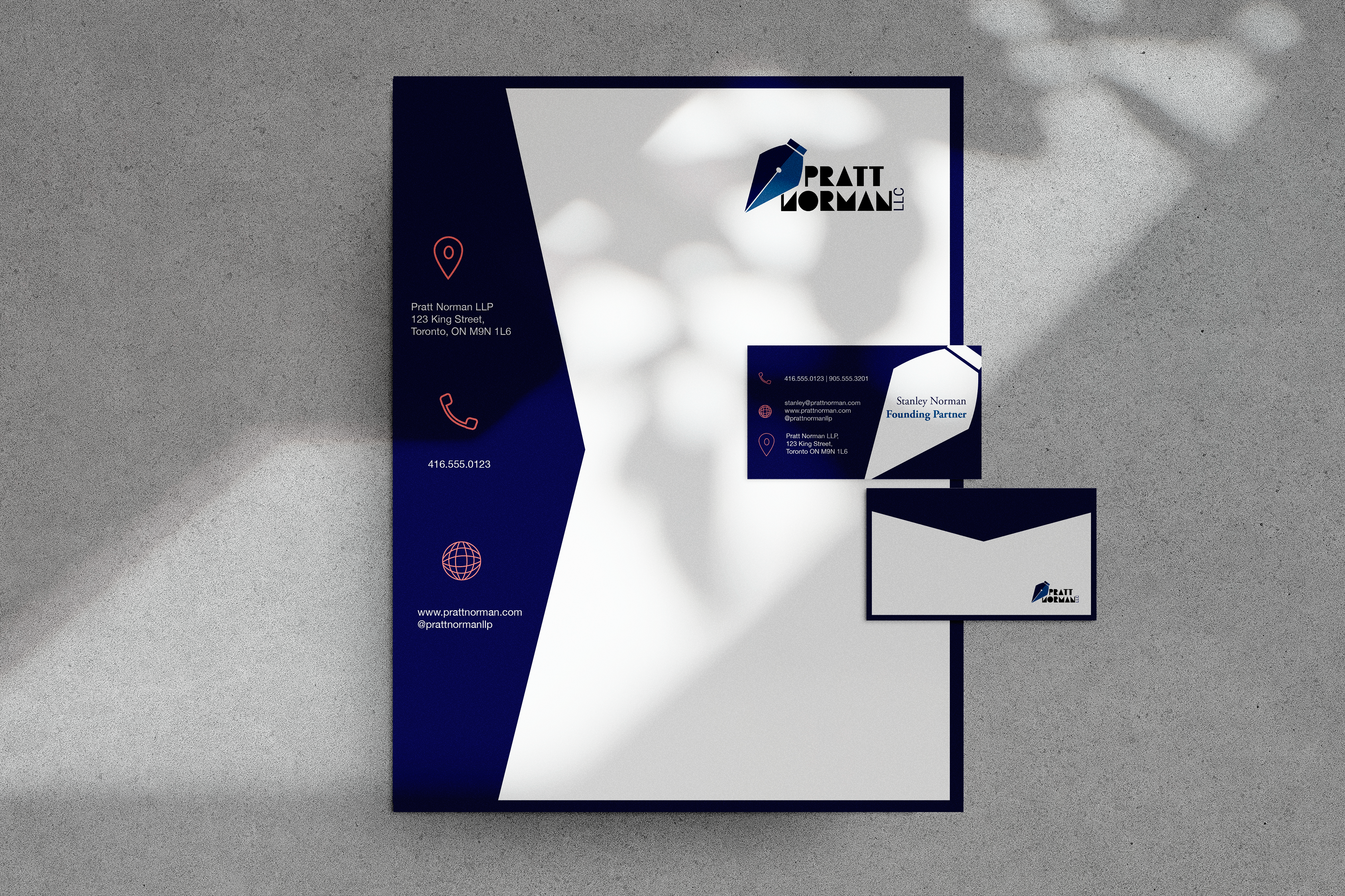
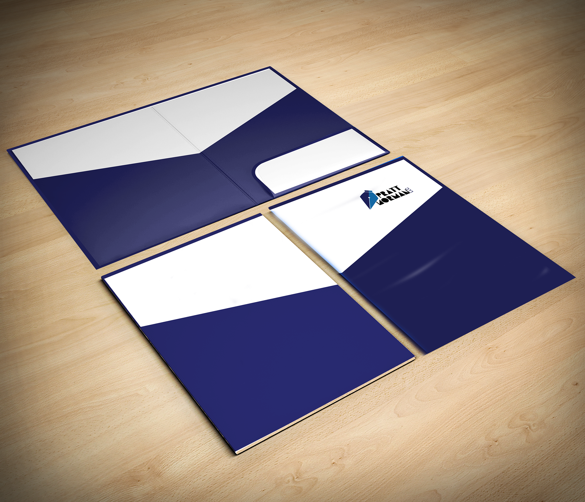
Since the established brand identity is minimal and modern, there is an abundant use of negative space on the stationary. The shapes used are fairly simple and employ straight lines to communicate the brand’s smarts and hard working values through the contemporary nature. These sharp clean edges further convey an extension of Pratt Norman’s authority, and foster a sense of stability, trust, and sophistication.
The uncluttered designs create a sense of honesty and transparency, which are a continuation of the brand’s professionalism through transparency and clarity of informatin. The additional use of the pink brand colour creates contrast and legibility of information, while adding a stylistic element that presents the modernity and stylishness of the organization.