Relish is a television network which is a Canadian authority on contemporary urban living that celebrates eco-conscious choices across food, design, beauty, and lifestyle. The brand is bold yet grounded, sophisticated but fun, targeting a fashion-forward, culturally curious audience seeking stylish ways to live more sustainably.
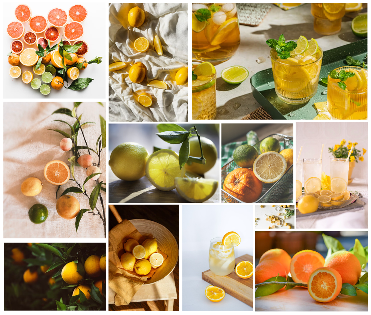
Concept: Moodboard
This project involved crafting a full brand identity system from concept to execution. The goal was to build a distinctive and versatile visual language that could come to life across digital, print, video, and social platforms while reinforcing Relish’s brand.
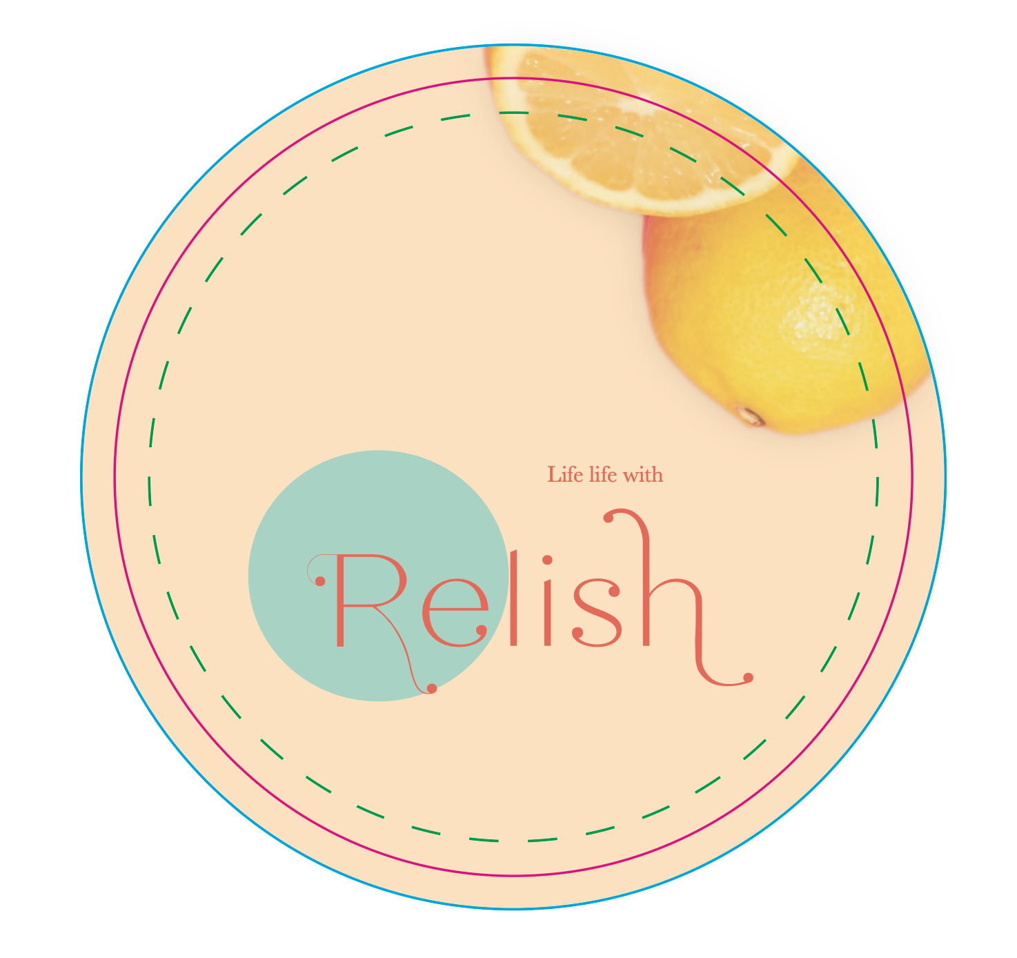
The visual identity uses citrus as a central metaphor representing freshness, energy, and zest, while the brand colours and typography create an editorial but welcoming personality. Deliverables included: a brand standards guide, creative direction for a promo video and a brochure microsite, a logo animation, business card design, social media templates, and a banner image and name plate for a new show hosted by the network.
Brand Standards Guide
The Brand Standards guide consolidates the visual identity system: the logo variations include a dynamic component, expanded colour palette, varied photography style, and varying layouts for varied brand purposes. It reflects careful thinking around flexibility, accessibility, and emotional resonance. This guide ensures consistency while empowering collaborators to maintain brand integrity across platforms.
The Brand Standards guide consolidates the visual identity system: the logo variations include a dynamic component, expanded colour palette, varied photography style, and varying layouts for varied brand purposes. It reflects careful thinking around flexibility, accessibility, and emotional resonance.
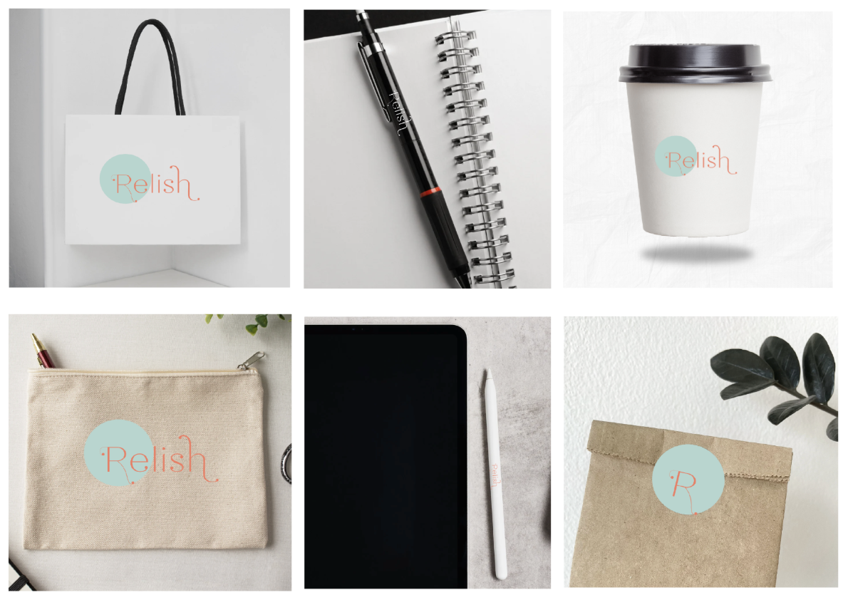
This guide ensures consistency while empowering collaborators to maintain brand integrity across platforms.
Logo Animation: Creative Direction
The logo animation brings the wordmark to life through a zesty reveal: a circular motion that hints at citrus slices and echoes the round shape of the brand’s visual motifs. The animation is short, sharp, and energetic - perfect for intros/outros, reels, or digital ads. This reinforces the brand’s identity through motion, aligning with its fresh and fun positioning.
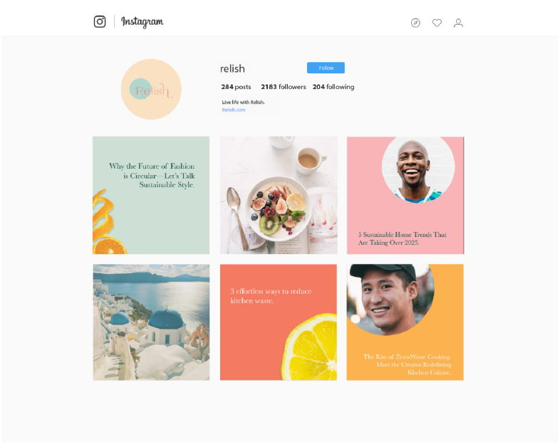
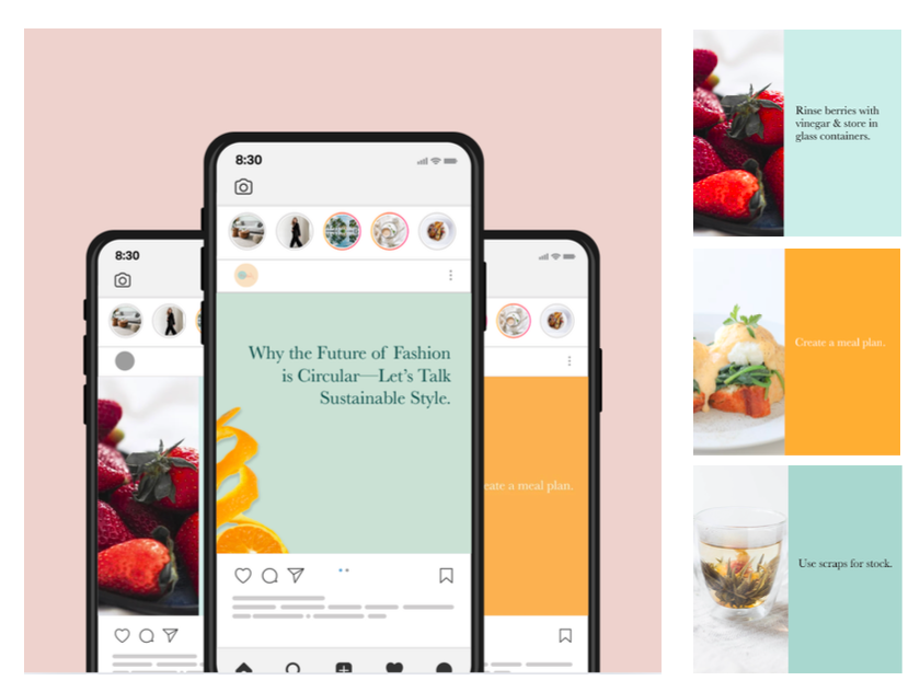
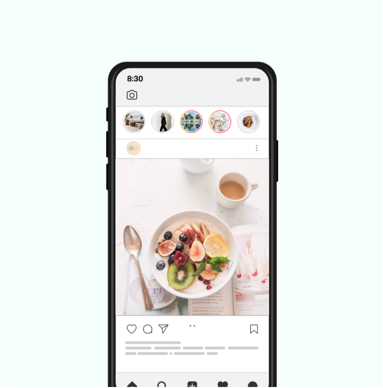
Instagram: Creative Direction & Templates
Relish’s personality shines on Instagram. The post system includes three content types: text-based tips (punchy, high-contrast slides), inspirational photo posts with clean editorial layouts, and informative reels styled with bold typography overlays. The templates use brand colours strategically for rhythm and visual impact while maintaining a strong content hierarchy to ensure accessibility. Together, these build a cohesive and highly shareable presence.
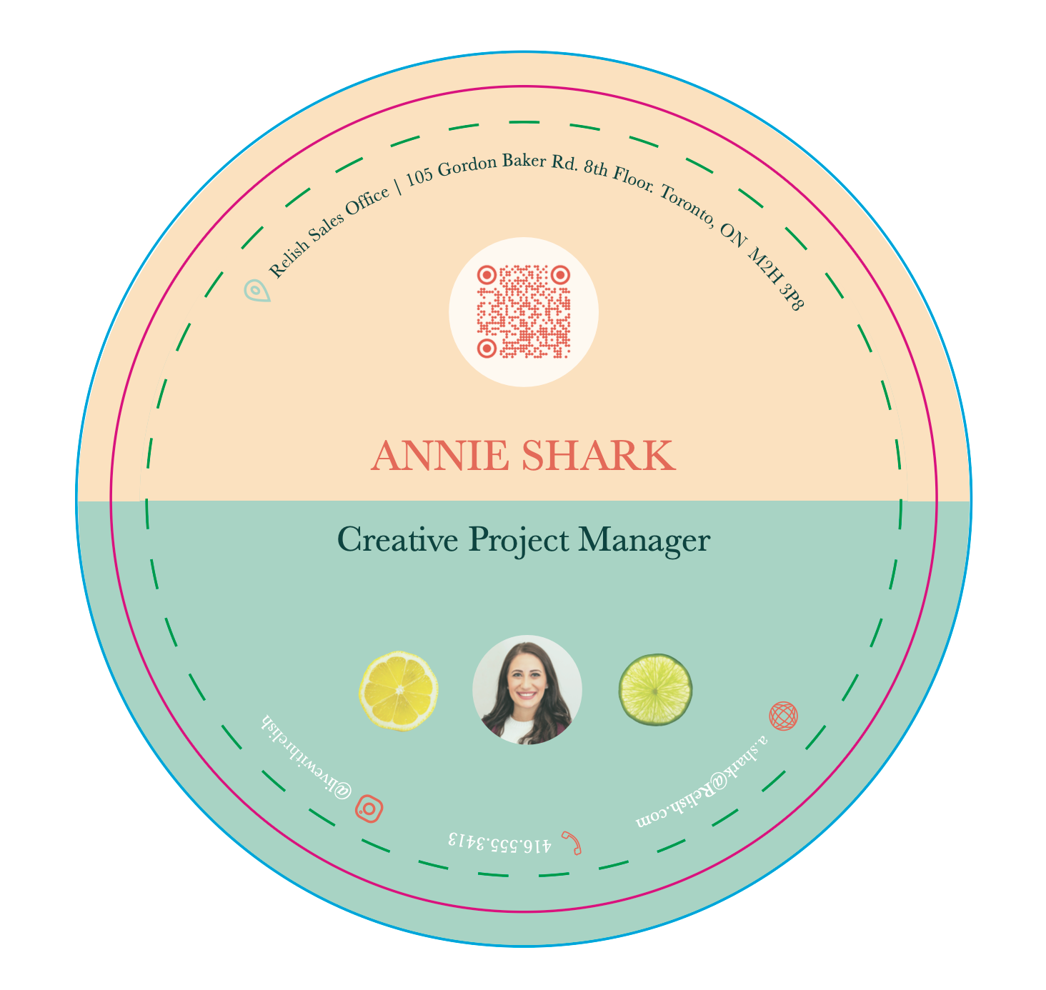
Business Card Design (Coaster)
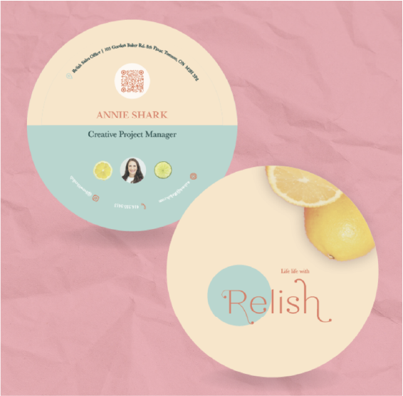
Designed as a die-cut coaster, this business card doubles as a functional and memorable brand extension. The circular form nods to citrus while encouraging a tactile, real-world connection - a natural fit for a brand rooted in lifestyle and hospitality. The typography and layout are intentional, using the bold brand elements to ensure instant recognition.
Brochure Microsite: Creative Direction
The microsite acts as a digital brochure - showcasing the brand story, editorial content, and product highlights. The layout is clean and grid-based, evoking a modern magazine. Scrolling interactions, large citrus visuals, and consistent type styling create an immersive, scroll-worthy experience.
It brings together the core brand elements in a flexible, user-friendly platform while reinforcing the design principles of clarity, warmth, and balance.
Network Video Promo Ad Storyboard
The Relish promo uses motion design, playful text transitions, and real-world clips to capture the brand’s spirited tone. The pacing and music are upbeat and stylish, inviting viewers to explore the world of sustainable luxury. The modular storyboard adapts across digital platforms, ending with the animated logo for a cohesive close. This video functions as a dynamic introduction to the Relish brand universe, sparking curiosity and setting the mood.
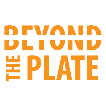
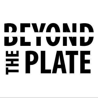
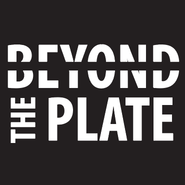
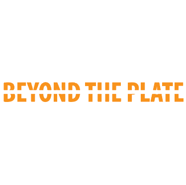
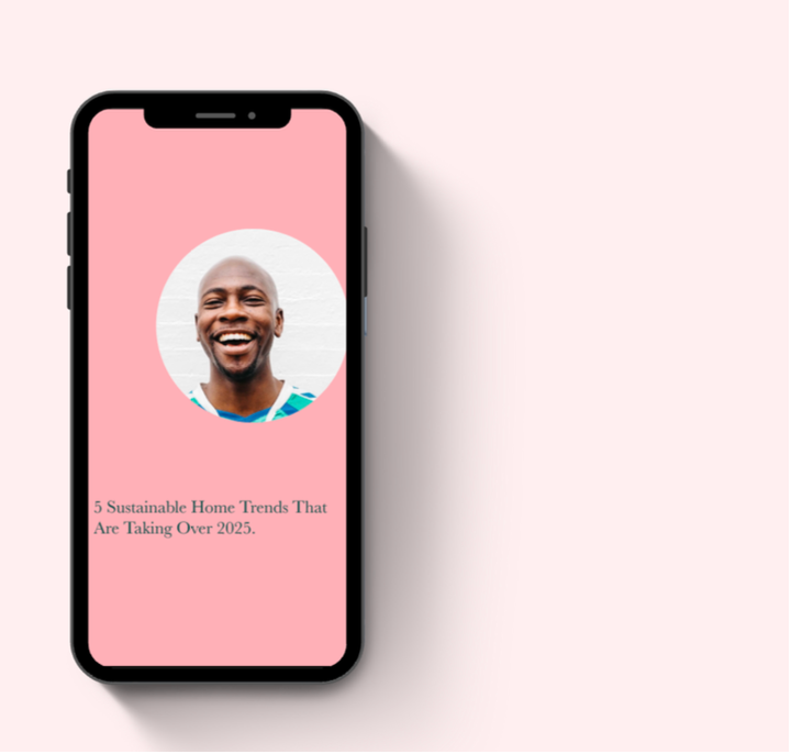
Banner Image & Nameplate for Feature Show - Food on the Side to Beyond the Plate
Food on the Side is equal parts travelogue and food documentary - exploring the cooking of cultures around the world.
Renaming the show from Food on the Side to Beyond the Plate was a strategic decision to better reflect Relish’s broader lifestyle storytelling beyond food — incorporating culture, community, and design. The nameplate blends editorial sophistication with an approachable energy, expanding on the concept of "beyond" with simplicity. The custom banner showcases a photo collage feel to highlight the diverse stories beyond the food, vibrancy, and connection, aligning perfectly with the show's focus.