Designed a premium die-cut label for Cohen’s Original Steak Rub, blending artisanal sophistication with packaging practicality. A hand-drawn custom illustration, refined typography, and an elegant die-cut shape elevated the brand’s gourmet appeal while ensuring print feasibility. The final design met all branding and technical requirements, delivering a distinctive, upscale identity.
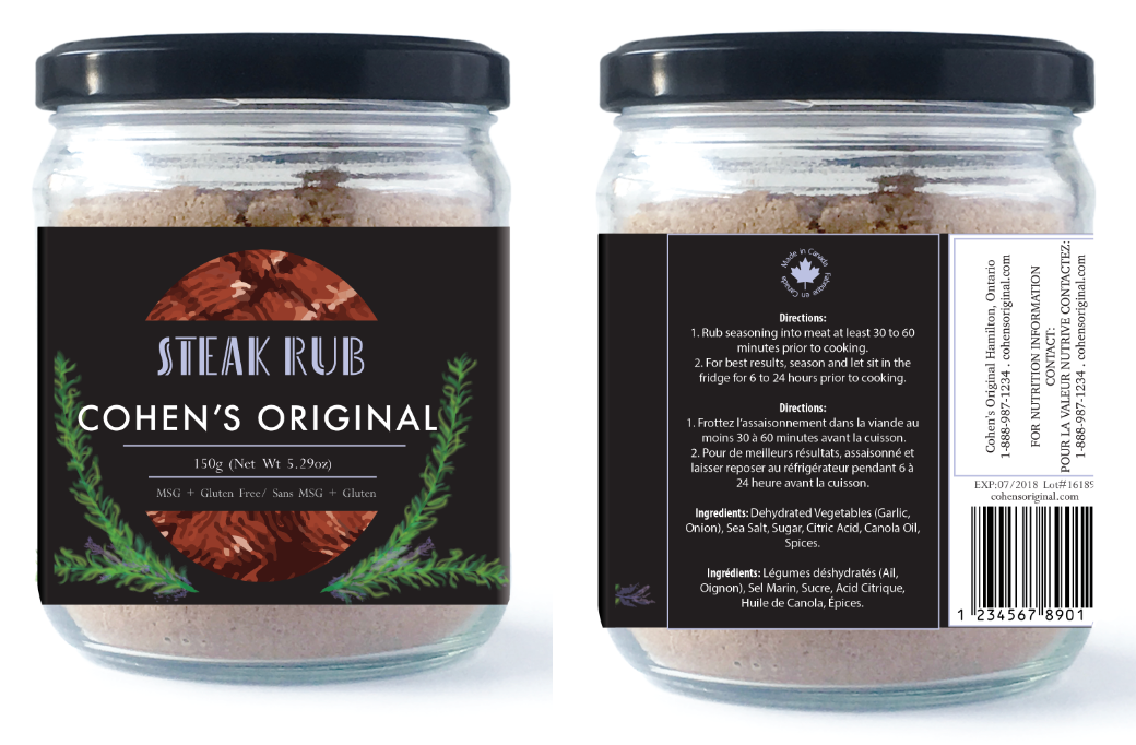
The fonts are chosen to balance simplicity with legibility and create a clean look. Two fonts are used for this information to create some variation and separate the ‘daily use’ information from the information that may be used less frequently. The product name is illustrated in a “high art” look that ties it into the ‘artisanal’ theme.
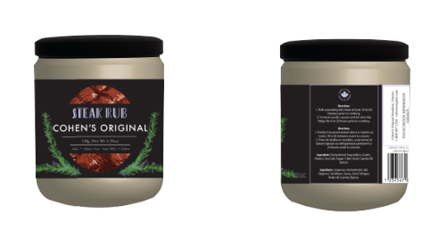
In the center, a steak illustration is used to depict the product’s purpose, while it is placed so that it seems like the label is wrapped on top of the steak – still showcasing it but in a subtle way. Rosemary is the primary element that frames the main information at the front of the label as it is a commonly used garnish for steak and used as symbolism for fine dining and ‘fresh’, ‘organic’, and ‘artisanal’ food.
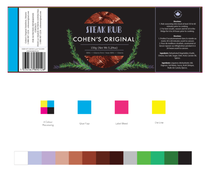
Black was chosen as the background colour of the label to balance the variance of colours. Since the rosemary framing is green with purple rosemary flowers, the purple is used as the product title text colour, and added as accents in places such as the border of some text, and ‘made in Canada’ sign to bring in the artisanal feeling of rosemary.