Designed a high-converting landing page for Marsh’s eco-friendly comic book and game-related subscription boxes. The layout combined bold comic-inspired visuals with a user-friendly structure, guiding visitors seamlessly from brand introduction to sign-up.
Dynamic colors, thick borders, and alternating backgrounds reinforced the comic aesthetic, while responsive design ensured accessibility across all devices. The final result effectively captured comic culture excitement while driving subscriptions.
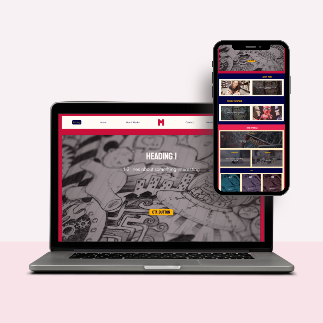
The overall colour palette is a dark pink, dark blue, and yellow as they create dynamism and an energetic design that is also evocative of comic book print and palettes. While the images used are a subtle nod to comics and comic culture, they are saturated to balance the bold colours and create a neutral background for text, where relevant.
The typefaces used are Koulen and Didact Gothic with the former being used for headings, titles, and CTAs due to its association with the typical comic style, clarity, and bold aesthetic. The latter balances the loudness by offering clarity and is used in explanations and additional text due to its subtlety.
The typefaces used are Koulen and Didact Gothic with the former being used for headings, titles, and CTAs due to its association with the typical comic style, clarity, and bold aesthetic. The latter balances the loudness by offering clarity and is used in explanations and additional text due to its subtlety.
The sections are divided so that the background colours are different in each consecutive area, so as to maintain visual interest. As well, thick borders are added to most sections to further stay in theme with the aesthetic of comics. Both vertical and horizontal scrolling are employed so as to not be too repetitive while consistency and hierarchy are maintained through the colours, typography, and layout.