
Designed a responsive website prototype for The Queen’s Gambit to engage literary enthusiasts while ensuring accessibility and a seamless user experience. The elegant, chess-inspired aesthetic reinforced the book’s themes, while structured navigation and responsive layouts optimized usability across devices.
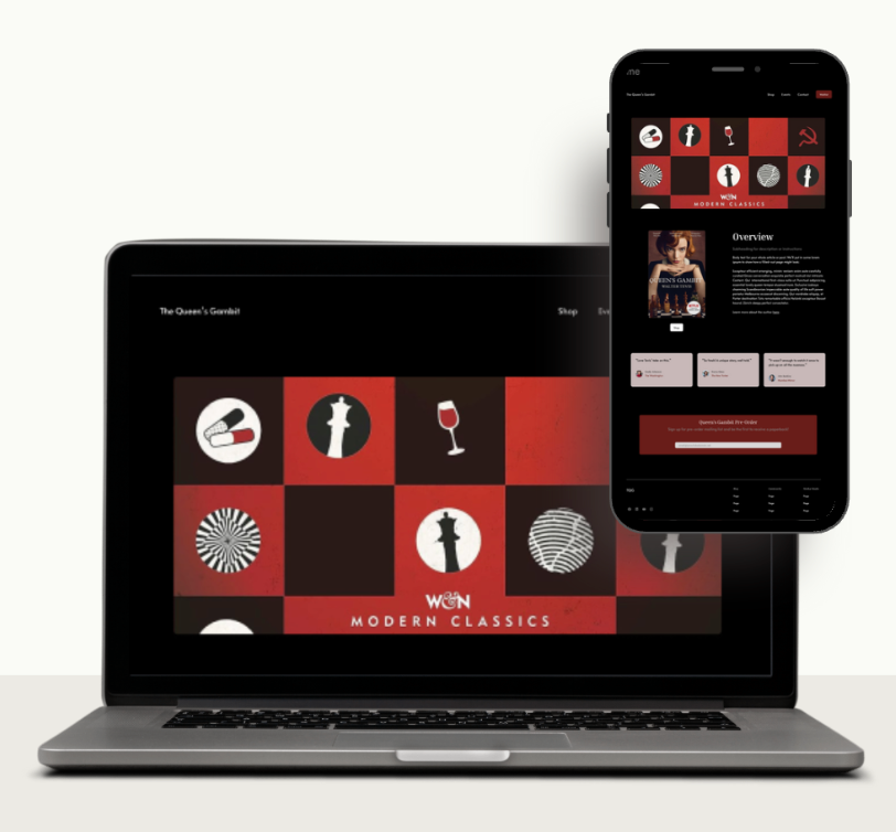

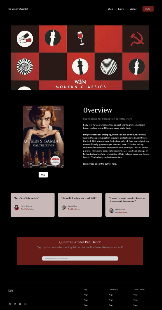
The overall colour palette is black, white, and shades of red to keep in the theme of chess, as well as highlight the main character (Harmon) who is depicted as a red head. The colour red further symbolizes the ‘Queen’s Gambit’ by evoking the red typically associated with the queen and her crown. Red further promotes action, hence it is used commonly within CTAs across the design.
The typefaces used are Inria Serif and Alata with the former bringing out the dignified nature of the main character while also referencing royalty through its serifs, and the latter bringing out modernity and proving more readable as blocks of text as compared to its counterpart.
The design is minimal to maintain a clean experience that does not scream for the user’s attention. The most important actions for the user are highlighted in a different colour or placed as buttons so as not to distract, but still draw attention. The overall colour scheme of black and white is suitable for accessibility while also drawing parallels to the chess theme of the story.
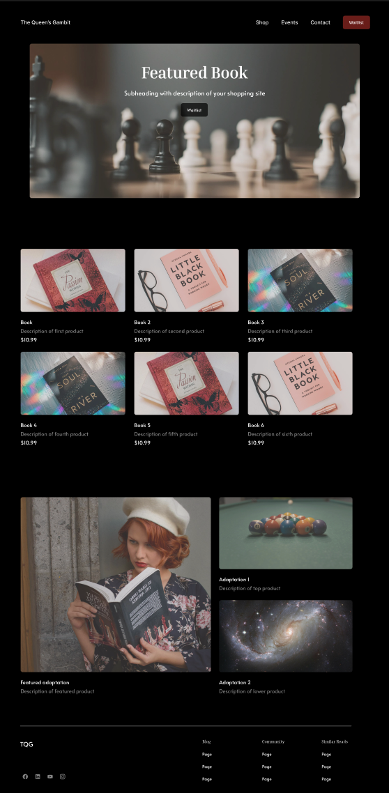
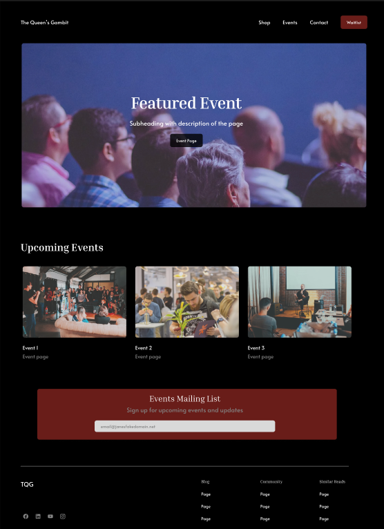
The images chosen are minimal, to match the aesthetic of the rest of the website. These images are also made opaque so as not to be too jarring against the black background.